A considered mobile experience that makes money management feel a little more human.
PROJECT
IndusInd Bank
MY ROLE
UX & UI Design · Interactive concept
TIMELINE
2026 · Design exploration
THE CONTEXT
Start with the people. Understand the problem.
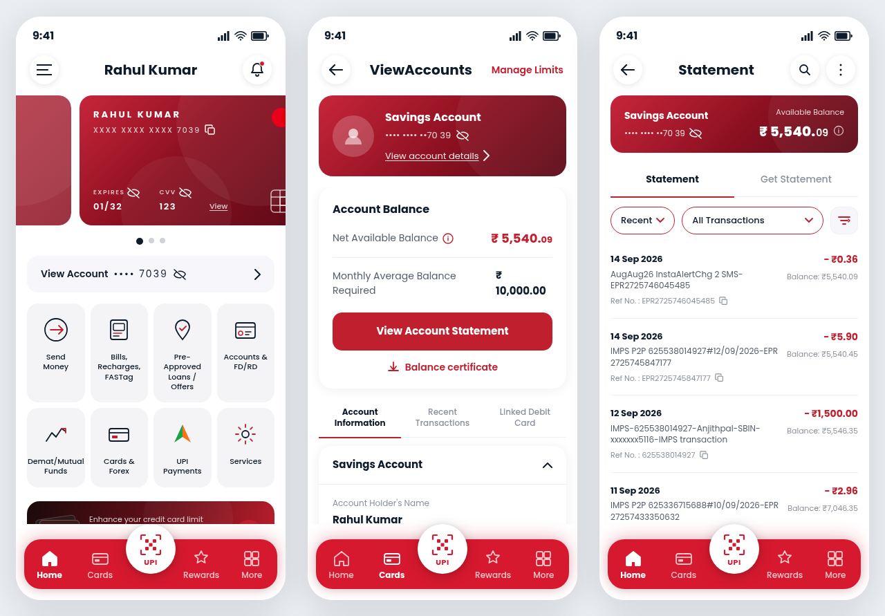
A mobile banking concept exploring how everyday account tasks can feel simpler and more connected. The shared Figma Make prototype brings account overviews, statements, card services, and UPI payments into a consistent mobile interface.
THE CHALLENGE
Less searching. More doing.
Banking interfaces need to accommodate many services without making routine tasks feel complicated. Account balances, payment actions, and transaction details should be easy to find while sensitive information stays under the user’s control.
THE APPROACH
A clearer path from intent to action.
The concept uses an account-first hierarchy, clearly grouped service shortcuts, and a persistent navigation pattern. A restrained burgundy visual language connects the account, statement, and payment screens.
01
The essentials, up front
Put the current account and available balance at the center of the experience. Give people a direct path from the overview to account details and statements.
02
Familiar, connected journeys
Keep home, cards, rewards, and services in a consistent navigation system, with a prominent UPI entry point for everyday payments.
03
Clarity with control
Support visible account-masking controls, recognizable transaction filters, and clear statement actions so people can manage what they see and share.
THE THINKING BEHIND THE INTERFACE
Start with the account. Keep the next step close.
Routine banking should not require learning the bank’s internal service structure. The concept organizes the experience around the account and the things a person wants to do with it.
DESIGNED FOR
People checking balances, reviewing transactions, and finding payment services
A UX reading of the supplied artifacts. The sequence below explains the design logic, not a verified chronology of research. Intended benefits and proposed tests are not measured outcomes.
The user's path
Check the overview
Choose an account
Review transactions
Filter a statement
Find a payment service
PROCESS & ARTIFACTS
How the problem becomes an interface.
01
Define the everyday tasks
The supplied prototype focuses on overview, account detail, and statement screens. These form a coherent task sequence rather than a collection of unrelated banking features.
02
Create an account-first hierarchy
Account information anchors the experience. Grouped shortcuts keep additional services available without making every feature compete with the balance.
03
Connect the screens
Consistent navigation and burgundy accents carry recognition across the three screens. Transaction filters and statement actions sit with the information they affect.
04
Validate with realistic scenarios
A next-step study would ask people to locate an account, find a particular transaction, and discover UPI. Observe wrong turns and whether privacy controls are understood.
Read left to right: overview → account details → statements. The same visual language connects each level of detail.
WHY IT IS DESIGNED THIS WAY
Every choice has a reason. And a trade-off.
Balance first, services second
A clear overview answers the immediate question of available money before asking users to choose from a large service menu.
THE TRADE-OFF
Secondary services may be less visible. Their labels and grouping must support discovery without overloading the overview.
Keep navigation familiar
Persistent destinations reduce the need to remember where a service lives when moving between an account and its history.
THE TRADE-OFF
Bottom navigation has limited space. Additional services need a deliberate hierarchy, not ever-smaller labels.
Give people visibility controls
Masking account information acknowledges that a banking screen may be opened in a public setting.
THE TRADE-OFF
Masking is a display affordance, not a security guarantee. Authentication and payment protections need separate implementation and review.
THE MOBILE EXPERIENCE
A connected view of everyday finances.
Explore the interactions behind the home, account details, and statement screens shown in the UX walkthrough above.
THE TAKEAWAY
Make the everyday feel effortless.
This prototype explores a connected visual and interaction language for IndusInd Bank. The next step would be usability testing around account discovery, statement filtering, and payment entry points. No production or measured usability outcomes are claimed for this concept.